

Display America
Design study · Architecture
Design study · 30x30 island concept · Natural products
Strategy before architecture: designing a 30x30 wellness island around the visitor
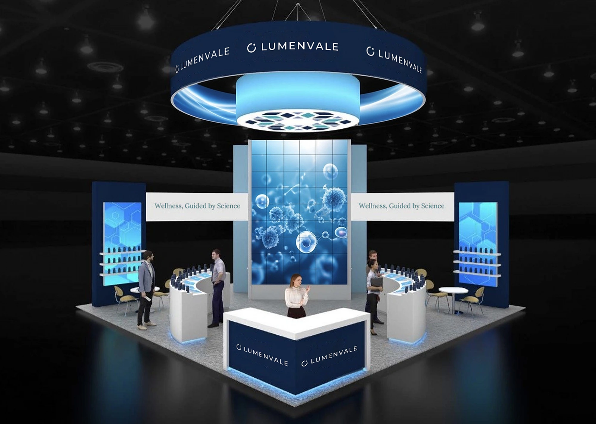
Every exhibit is a building with a job to do. Before we draw a wall, we define who it is for, what they should do inside it, and how the space will lead them there. This design study, a 30x30 island concept for a science-led nutritional wellness brand at a major natural products trade show, shows that approach in full: strategy before architecture, and architecture before visualization.
The work shown here is a Display America design concept: architectural studies and renderings, not a finished build.
Strategy before architecture before visualization
On a 900-square-foot island, sampling, product, meetings, storage, media and circulation all compete for the same footprint. Start with renderings and those needs get settled by appearance. We settle them in order: strategy (audience, behavior, story), then architecture (program, adjacency, flow), then visualization. Every visual move should trace back to a decision the client helped make.
Understanding the visitor experience first
Our process begins with a discovery and Concept Strategy Session with the brand team, built for alignment, not design approval. We confirm what we learned about the brand, then answer the questions that shape the plan: Who matters most here? What should they do? What must the brand communicate?
For this brand, the answer was clear. The primary audience is retail buyers, both current partners and prospective accounts. New buyers are the hardest to engage, so we treated them as the critical growth audience. The target behavior follows: enter without friction, sample, find relevant categories, understand the science, meet the team, and move into consultation.
We mapped that behavior as a four-stage journey:
- Arrival + Sampling. Notice the brand from the aisle, understand the offer, and step in for an easy first interaction.
- Discovery + Education. Browse, choose what’s relevant, and understand the science behind the portfolio.
- Connection. Ask questions, meet the experts, and build confidence in the brand as a partner.
- Consultation. Talk through account needs, category opportunity, and next steps.
One working rule governed everything that followed: design for comprehension and movement into consultation, not product density.
Programming, adjacency and sightlines
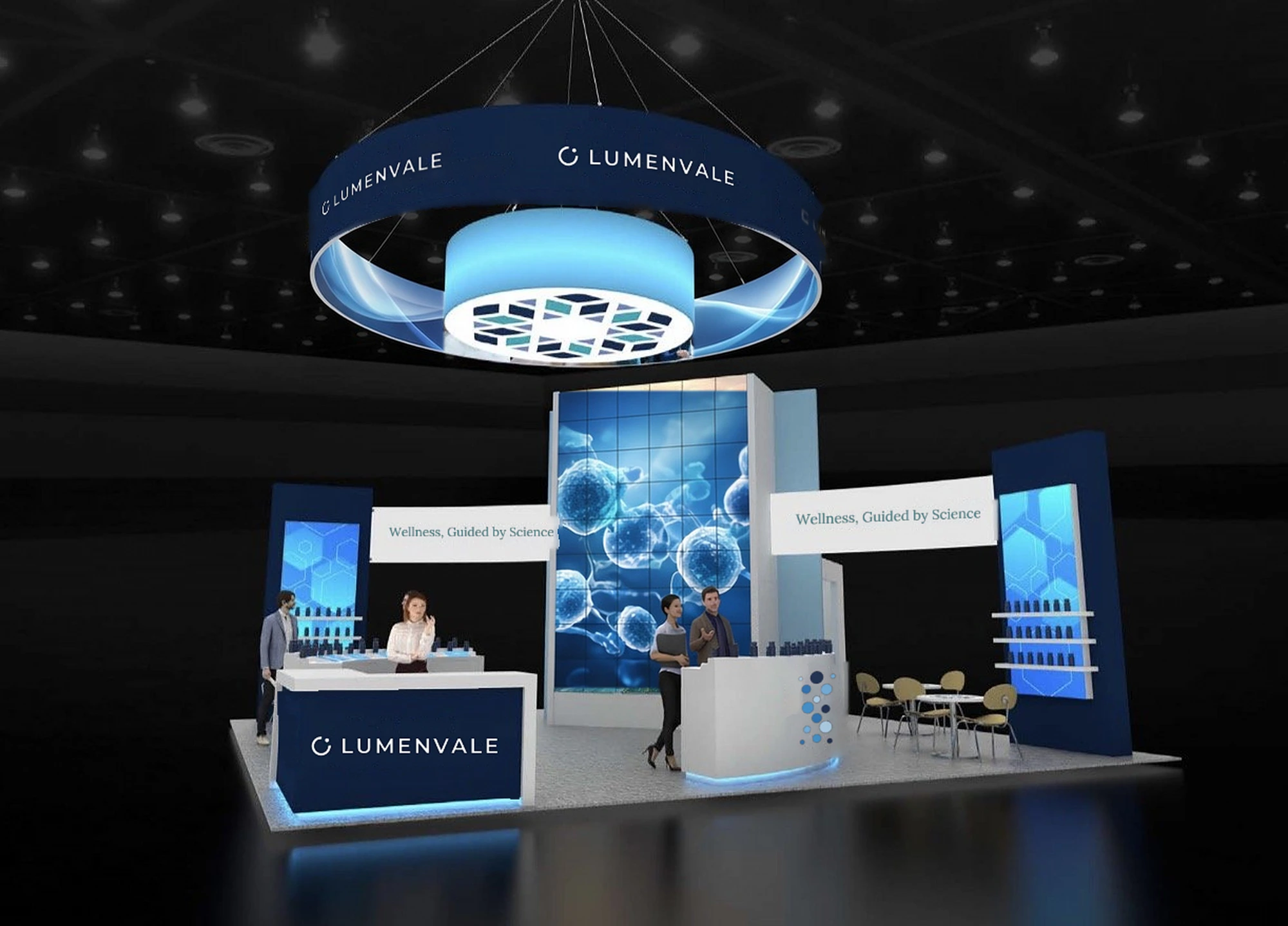
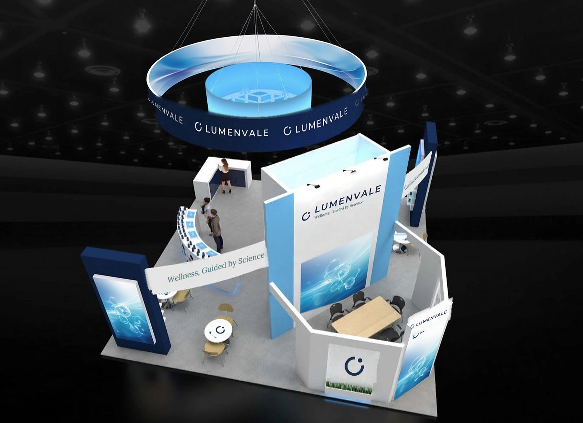
With the journey defined, we programmed the island by priority rather than by square footage. Discovery + Education gets the largest share and the longest dwell time, so it sits beside Arrival + Sampling. Sampling stays visible but organized, never a wall of people at the aisle. Connection sits close to discovery, so conversations start once interest is established. Consultation is semi-private and buffered from the noisiest traffic, but still connected to the active floor. Storage stays hidden but within reach.
The journey has no forced one-way path; sightlines guide instead. From the aisle, a buyer can read the brand, see the way in, and enter discovery without committing to a conversation. Staff positions follow the same sightlines, so the team can engage once a visitor signals interest.
Geometry, light and structure as wayfinding
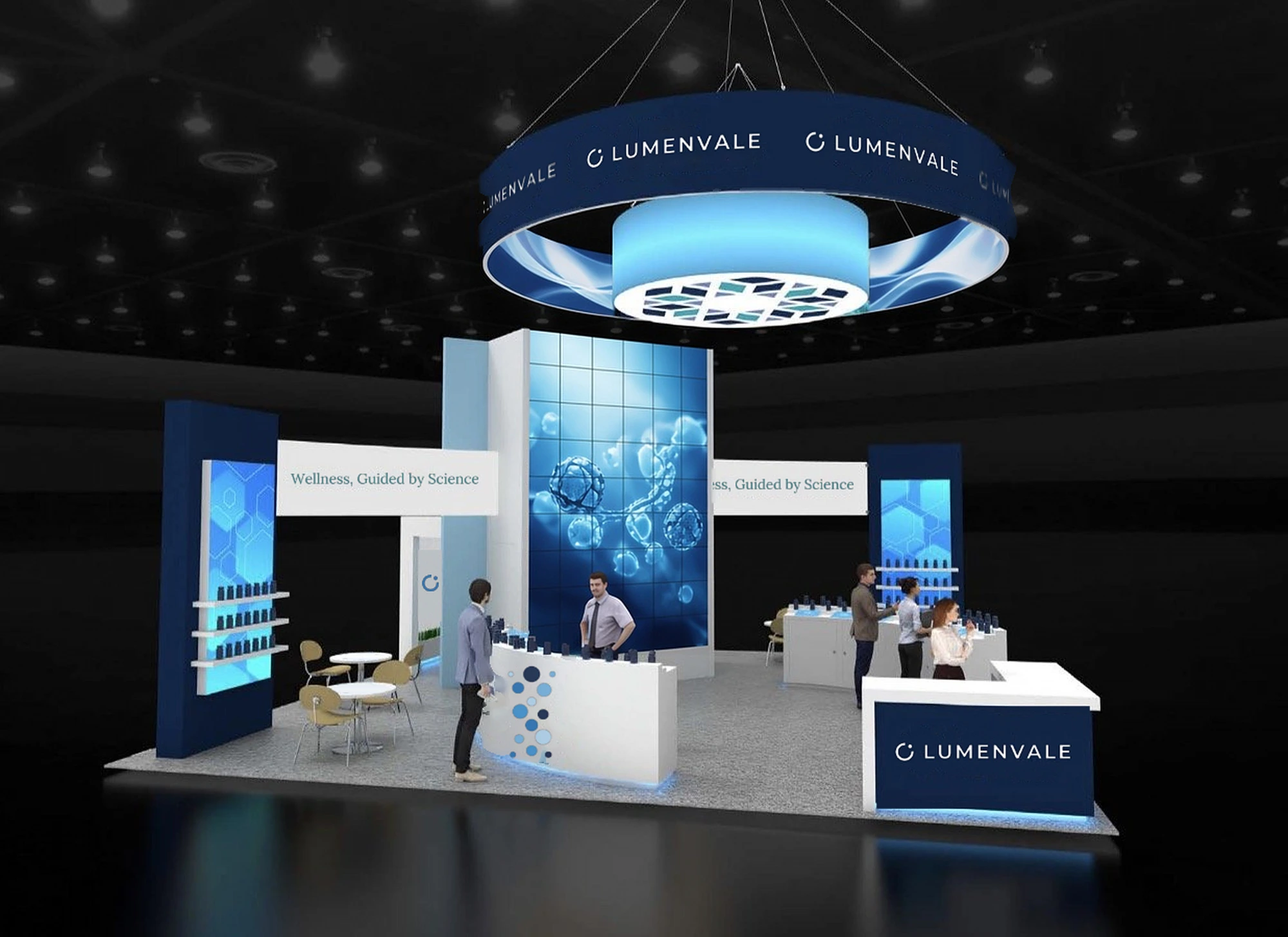
Ceiling, floor and lighting work as one system that makes the progression legible. A geometric motif drawn from the brand becomes architecture: in the overhead identifier, the ceiling plane and the lighting. It appears in one or two deliberate expressions, never as decoration, and the logo stays untouched. Structure carries the brand too: with the logo removed, the space should still feel specific to it.
Experience Studies: one decision at a time
Before refining the form, we tested it in Architectural Experience Studies. Each study isolates a single decision so it can be judged on its own: how sampling should feel, how much physical product discovery needs, how open each conversation space should be, how the overhead element reads from a distance, and which material and lighting atmosphere fits the brand. The feedback shapes coordinated, feasibility-tested directions, not cosmetic variations of one plan.
The design, as proof
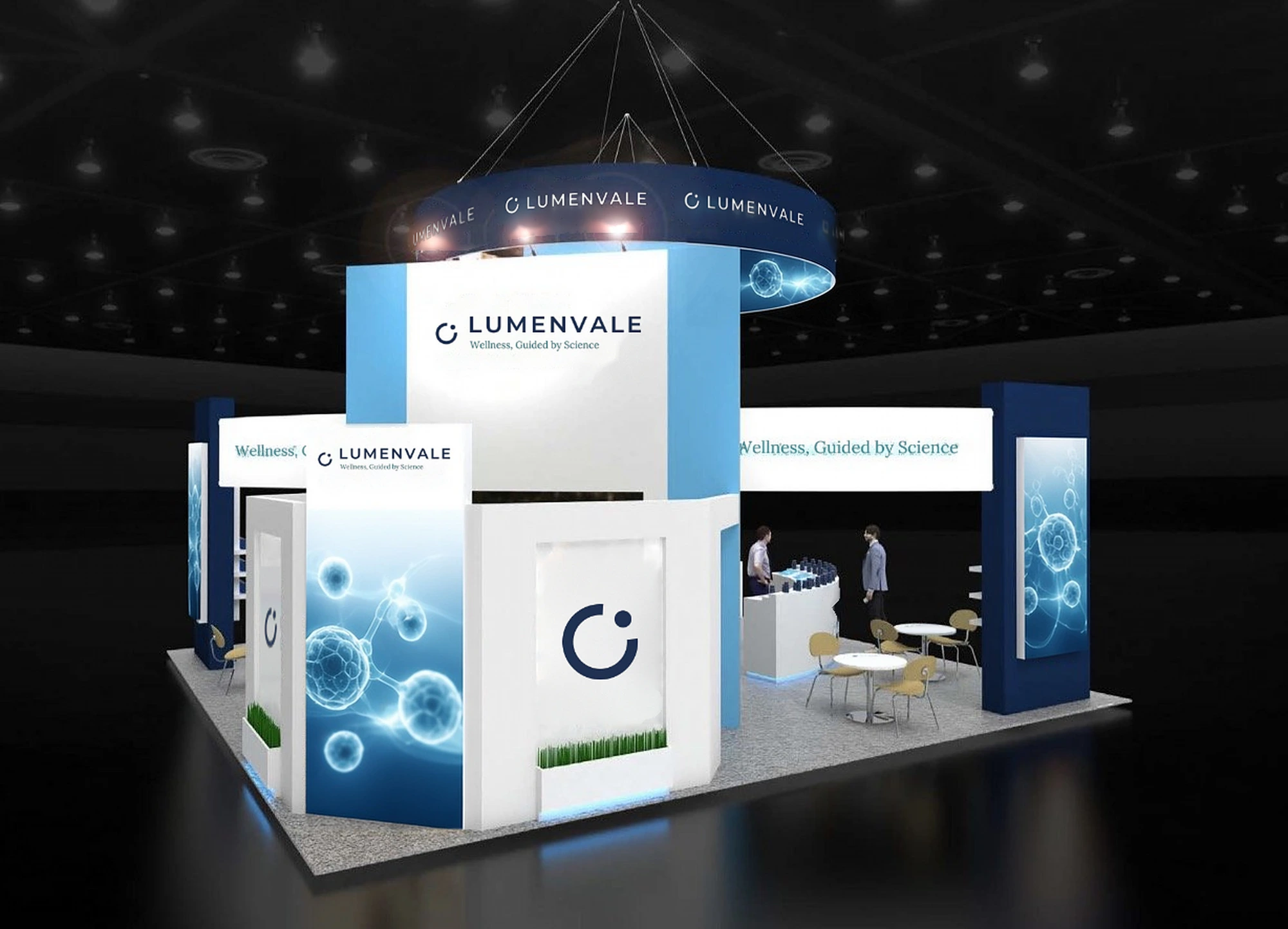
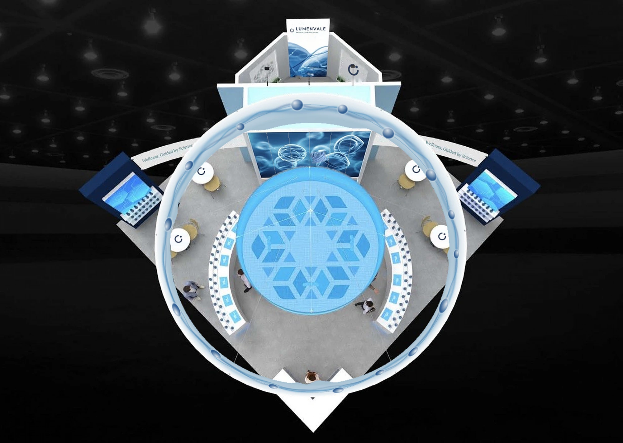
A suspended circular header carries the identity to every aisle, with a luminous drum beneath it whose patterned underside anchors the plan. A tall LED video wall at the core shows portfolio breadth digitally first. Lit towers frame the corners with a curated selection of products, used as proof rather than inventory. Curved sampling counters and a front reception counter open toward the aisles. Behind the active floor, an enclosed meeting room gives consultation privacy and quiet without hiding it.
What it shows about Display America
We design exhibits the way architects design buildings: behavior first, then program, then form. The result is a space where the booth’s job, bringing a new buyer from first look to a real business conversation, is clear in the plan.
Planning a 20x20 or larger island for 2027? Let’s start with the strategy.
Email info@displayamerica.com or reach us at (888) 299-0611: Text · Call